Friday, September 23, 2011

Assembly Line Challenge

# of achievements: 19

Class Achievements:

"Implementation" - Implement an assembly line system that meets the criteria and constraints of the challenge.
  • We built the 1st mark station
"Fast!" - The system is able to complete a cycle of 6 dice in less than 1:30.
  • We never timed 6 cubes, but we did time 4
    • The time for 4 cubes was 1:37, and that was fairly close to 1:30
      • There were a couple errors that came with that, so the time would have been better if all the cubes ran through smoothly.
"Stewardship" - Return all Fischertechnik to appropriate storage upon completion of challenge. Leave the room cleaner than before the start of the game.
  • Along with putting my stuff away, I have been working to clean the whole organizer set in the front of the classroom


Team Achievements:

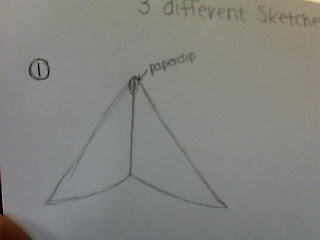
"Flash of Inspiration" - Brainstorm a solution for your section of the assembly line with a sketch.


"If you Build It..." - Implement a solution for your section of the assembly line.


"Proof is in the Pudding" - Implement a solution for your section of the assembly line that successfully operates with adjacent sections.
  • We had a few errors at first, but then we fixed them with different programming
    • ours ran exactly how we wanted and continued running

"Round and Round We Go" - Iterate on your initial implementation. Explain the challenge you discovered off the first effort and what you did to overcome it.
  • First problem: the cube would fall off the side of the assembly line
    • fixed by: adding walls so the cube would stay on

"Round and Round We Go... Again" - Iterate again on your implementation. Explain the next challenge you discovered with your design and what you did to solve it.
  • Second Challenge: The rubber band for the motor kept falling off the wheel
    • Fixed by: taking out one of the wheels and then just changing the speed of the line on the robopro (best solution but it took a long time to discover!!!) 

"Videography" - Capture video of the project in action.

"No Soliciting" - Generate at least one item of feedback from other teams relating to your solution for each of the four feedback types (Sustain, Change, Question, Idea).


"Lab Rat" - Collect data related to your implementation. Explain what you collected and how you used it.
  • We colleted data on how fast our part of the assembly line worked (4 times)
  • We timed from the moment the cube fell onto the belt, and then stopped the time when it left the belt.
  • We used this data in a chart in order to graph it, so we could see what the average speed was


"Show Me" - Visualize your data in a useful format. Explain your choice of presentation.


  • I decided to use a chart to visualize my data
    • I tried making a graph with all the data, but with so many numbers it was very hard to visualize the data in an easy-to-read manner

"Leave no Trace" - Return your fischertechnik to their appropriate storage locations/clean your work space.
  • I have been working not only to put my stuff away, but to clean and reorganize the whole fischertecknik kit up at the front of the classroom
    • VERY HARD I must say!!

Individual Achievements:

"Share It" - Provide feedback (Sustain, Change, Question, Idea) for another team. Who did you provide feedback to and what was it?

  • The feedback was for Andrew and Rafe
    • They constructed the start of the assembly line piece

"Keep the Customer in Mind" - Your blog post is formated in a readable, professional manner. Writing is short and concise. Spacing is used to break up thoughts/concepts. Lists and/or bullet points are used as appropriate. No "monolithic" paragraphs.
  • I have learned from last year paragraphs are not easy or fast to read so I avoided those!
    • Instead I used short bullets to explain my thoughts

"Nice One!" - Identify a student from outside of your team that was most helpful to your efforts. Be specific about how they were helpful.
  • Gustavo was the most helpful
    • Since Morgan and I are new at programming, he helped us program the light sensor on the assembly line
      • This helped us time the marker to mark the cube at the perfect time

"Helping Hand" - List a student that you helped outside of your team. How were you helpful to them?
  • I helped Andrew and Rafe
    • A message came up and said they needed to do something and I helped them notice their power was off on the programer
    • Also since they are group 1 and we are group 2 I helped them figure out how to build their project
      • Helped with speed, and a more efficient way of sorting the dice

"Meta Gamer" - Based on our grading system for this challenge, explain the benefit of earning the class achievements, even though everyone scores them when earned (use math to justify your case).
  • Benefits:
    • if you earn all the class achievements you will be caught up with everyone else and not lack any points
    • if you earn the class achievements and you have all the other achievements you will be the stabalizer for the grades
      • Math: 10 class achievements + 18 other achievements= all acievements (A+)
      • 10 class achievements + 10 other achievements= 20 achievements
    • But if you earn all the achievements and don't earn all the others, at least you are getting some points even if you don't get all of them

"And the Winners Are..." - Recognize class participation by selecting one person other than yourself for each of our five activity awards (Initiative, Sportsmanship, Collaboration, Humor, ...what's the fifth one we have up on the board?!)
  • Initiative: Gustavo
  • Sportsmanship: Morgan  
  • Collaboration: Andrew Cuban
  • Humor: Rafe
  • Improvisation: Hunter


This is jsut the programming we used. Thought it was cool so I posted it!!

Thursday, September 8, 2011

Visual Visualization

The units for the first column of data is in cm, and the second column is in newtons (N). The reationship of force vs. distance is exponential. You can tell because the graph starts off moving in little incriments but then it shoots up, and will continue to grow at rapid rates.

Wednesday, June 1, 2011

Final

Problem:
We need to store a bike to living space from being taken up.
Brainstorming:
have two hooks on the ceiling and then hang the bike by its tires
have two hooks on the wall and then hang the bike by its tires (better for dorms with tall ceilings)
if you have a balcony, just get a bike lock and lock your bike outside
put your bike on the shelf that is usually present in the closet
require a foldable bike for all people on campus, and make the expense part of the dorm fee (bike when folded could be stored on the shelf in the closet)
Criteria
bike storage
easy to assemple
Constraint
no permanent damage
Sketches


Dicision Matrix
***Best one has the least total points

CAD Models

Multiview


4 Quadrant Feedback

Thanks for an awesome year! I learned a lot. Eventhough it was challenging at times this class was awesome!!

Tuesday, May 3, 2011

Locker Assignment

I was absent on Friday when we did this assignment in class becuase I had to take an AP exam. I got as much done as possible, but it is not completely finished!!
Design Phase
Identify the Problem--
  • Lockers are a mess, design something to help organize them. 
Investigate the CHS lockers--
  • Regular Locker Dimensions
    • Width-10 in.
    • Height-17 in.
    • depth-11 in.
  • Football Locker Dimensions
    • Width- 14 in.
    • Height- 45.5 in.
    • Depth- 17 in.
Brainstorm Solutions--
  • Regular Locker:
    • 1st:
      • Have two shelves on the right side of the locker
      • Have a hook on the inside on the left side for backpack
    • 2nd:
      • Have one shelf on the top and one shelf on the bottom
    • 3rd:
      • Have a drawer on the bottom for pencils and paper
      • Have a shelf on the right side
      • Have hooks on the left side for hanging
  • Football Locker
    • 1st:
      • Have two shelves on the top on the locker for shoes, and padding
      • Have a bar below those two shelves for jersey's
    • 2nd:
      • Have one shelf on the top and then another shelf on the bottom
      • Have a bar below the top shelf
Sketch Three Possible Solutions (include labels and important dimensions)
 
Identify Criteria and Constraints
Criteria:
1. Design a locker on the CAD software
Constraints:
1. Design must fit within your school locker.
2. Easy to install.
3. Must hold 20 lbs of books and binders.
4. No flammable materials.
Select an Approach (justify selection with specifics)--
  • Football locker
    • One shelf on top for pads or helmet
    • One shelf on bottom for shoes
    • A bar below the top shelf for jersey, and jacket
Prototype Phase
Craft your design in CAD:
-Use an assembly of parts.
---Create an Isometric view of your assembly.
---Create a multiview drawing.
-----Label your multiview drawing with dimensions.
Each student will do their own CAD work (You may collaborate in and outside of your team but the actual work must be your own).

Friday, April 29, 2011

IDEO Shopping Cart

1. “From the buildings in which we live and work, to the cars we drive, or the knives and forks with which we eat, everything we use was designed to create some sort of marriage between _________________ and _________________.” Form and Function


2. The folks at IDEO state that they are not experts in any given area. But, they do claim to be experts on the ____________________, which they apply to the innovation of consumer products. process that they design stuff like the toothbrush...

3. After the team of designers is brought together, told the problem, and informed they have five days to “pull it off,” what phase of the design process do they immediately engage in? brainstorming designs

4. Give two examples of what the team members did during this phase.

a. drew sketches of the ideas they had
b. went to places where the people actually design and make shopping carts, and asked what they think


5. List five rules-of-thumb that IDEO employees follow when they share ideas during the brainstorming phase:

a. one conversation at a time
b. stay focused
c. encourage wild ideas
d. defer judgement

e. build on the ideas of others

6. Why should wild (and sometimes crazy) ideas be entertained during the brainstorming phase?
in order to stay focused


7. After the brainstorming phase was over, the team narrowed down the hundreds of ideas by _____________ for those ideas that were not only “cool” but also _________________ in a short period of time. What phase of the design process is this called?

looking, could be designed
Research and Generate Ideas


8. IDEO believes that the ideas and efforts of a ______________ will always be more successful than the planning of a lone genius.
trial and error


9. Once the ideas were narrowed down and divided into categories, the group was split into four smaller teams. What phase(s) of the design process was each of these groups responsible for?
Select an Approach
Almost like they went through 6-12 of the design process and then got into a bigger group and went straight to 6 again.


10. The leaders at IDEO believe that ________________ behavior and a ______________ environment are two important reasons why their employees are able to think quickly and creatively to produce innovative results.
working together, cahotic


11. Sometimes, people come up with great solutions that work by trying their ideas first, and asking for _________________ later.
forgiveness


12. Design is often a process of going too far and having to take a few steps back. What phase of the design process would the critique of the four mock-ups come under?
Explore Possibilities


13. Upon critique of the four teams’ models, it was obvious that none of the teams had developed an optimum solution. However, the people at IDEO believe that it is important to _____________ often in order to _____________ sooner.
fail, succeed


14. What percentage of the entire week’s time did it take to fabricate the final prototype?
it took 1 day aka a lot of hours to finish it


15. Instead of showering his design team with a tremendous amount of praise, what did the boss require his employees to do with their new design?
go to the local supermarket, and get other people's opinions


16. Of all the things that we are surrounded by every day, what has not been placed through the design process?
Everything in nature, but other than that everything has been put through the design process

Conclusion

1. What did you find to be the most impressive part of the team’s effort?
  • I thought it was impressive that the team worked so well together. Even if the team members did have a problem with another person it didn't show.
  • I also thought it was impressive that not one person did the whole project. Each person helped either by taking notes, drawing the design, or going to the supermarket. It really stands out when the whole team works together and not by themselves, much more efficient!!!
2. What advantages are there to having a design team with members that have non-engineering backgrounds?

3. There was a point in the process where a self-appointed group of adults stepped up, stopped the ideas, and redirected the group to break up into teams. Why was this done?


4. At the end of the video, Dave Kelly states, “Look around. The only things that are not designed are the things we find in nature.” Can you think of anything that would contradict this statement?
beaver damns- beavers have to design something in order to stop water and something to help them live in.

Tuesday, April 26, 2011

Glider in class test (4pts)

CAD MODEL

MULTIVIEW CAD MODEL

There was some confusion about this post. Emmet, Trent and I all had the same model. Honestly we all worked on it together, and I did the multiview drawing completely while Emmet watched how I did it. But, I know we were not supposed to work together on the glider. My computer freaked out after I had assembled the glider, and all the parts got saved, but the glider did not. I was in a time crunch and therefore used the glider that I helped work on with Trent and Emmet. If we would have had time in class on Thursday I probably could have finished, but I know the grades were supposed to be in so I put the same glider on my blog. I am sorry for having the same one, but I didn't want to have nothing on my blog.

Tuesday, April 12, 2011

Glider Challenge


The Grom Chillib Flyer
Design Phase: 
  1. Challenge: to design a glider that will fly the farthest, and a glider that will hang the longest in the air.
  2. Brainstorming rules: to discuss with all your group members to come up with the best designs that meet the criteria and the contraints.
      1. 1st rule: don't just use your own ideas, let others contribute and make a group effort to decide which one is the best.
      2. 2nd rule: draw the designs as you go so you don't forget!
    1. Ideas:
      1. have two wings, and one main part with paperclips in the front for weight
      2. have 4 wings, and one main part with paperclips on the front, and a bolt on the bottom for extra weight in the front.
      3. shape the wood in the front so it isn't squar, and then have two rectangular wings to provide the plane with more wing surface area.
    2. Sketches


  1. Criteria: make a glider with the given materials (tissue paper/computer paper, balsa wood, glue), tape, although many people added other materials
  2. Constraints: only allowed to use tissue paper or computer paper, certain amount of balsa wood, glue, and tape to construct a glider that beats everyone elses designs.
  3. Design:
CAD Model of The Grom Chillib Flyer
Test Phase

4 Quadrant Feedback Notes
Goals:
  1. Have glider stay in the air the longest
  2. Have glider fly the longest distance
In the first round we won both the challenges, but in the second round Jordan and his group won the longest distance challege.
We could have our wings more flexible, so they move up and down (fluttering) in order to keep the air under the wings at all times!!

Looking Over the Challenge
  1. Our glider won both the longest distance, and the longest time in the air in the first round.
    1. We were pretty happy, but then in the second round Jordan and his group came out with a great glider that soared and flew pretty far! Impressive for sure!!
  2. Looking back at Jordan's glider, we would have made our wings able to move and flutter like theirs in order to keep the plane flying straight for a while!
    1. The wings fluttering helps keep the air underneath the glider longer!!

Monday, March 21, 2011

Egg Drop Challenge!!!!

  • Team up with a partner
    • Bethany Purdy
  • Define the challenge, criteria and constraints
    • The challenge: construct a barrier to protect the egg from breaking when dropped off the 2nd floor balcony of the 700 building
    • right now there are no constraints or criteria
      • but to get as many points as possible for the achivements one has to:
        • make the barrier a certain size
          • biggest: material fits into a paper box
          • smallest: material fits into an altoid box
        • make the barrier weigh a certain amount
  • Brainstorm solutions
    • first:
      • shoe box, bubble wrap, tape, paper towels, tin foil, baggie, 2 shirts
    • second:
      • bubble wrap, tape, baggie
    • third:
      • pillow, tin foil, tape, baggie
  • Identify materials to bring in for "Build Day" (block day)
    •  2 shirts, paper towels, tape, baggie, phone box, bubble wrap, tin foil
Achievements:
Brainstorming-Create a sketch of one possible solution. Include labels.
-Create a sketch of another possible solution. Include labels.
-Create a sketch of a third possible solution. Include labels.
-Use a decision matrix to justify the approach you chose.


problem: there is a tie between design 1 and design 2
solution: look into how many achievements for each would be earned, and pick the one with the higher achievements
  • Design 1: 12 achievements
    • 2 out of 4 size
    • 1 out of 7 weight
    • 3 out of 5 drop
    • 6 out of crack vs intact
  • Design 2: 13 achievements
    • 3 out of 4 size
    • 7 out of 7 weight
    • 3 out of 5 drop
    • 1 out of 6 cracked vs intact
With all this information, in order to earn more achievements we should have picked design 2 instead of design 1!
Material Prep
-Generate a list of materials required for build day.
  • 2 shirts
  • paper towels (1 ft)
  • tape
  • (tape box together)
  • bubble wrap (3 in X 3 in)
  • phone box
  • tin foil (3 in X 3 in)
-Document a plan to ensure materials are brought in on block day.
  • Bethany came over to my house and we gathered all the materials
  • We put all the materials into the box
  • I put them next to my backpack the night before so I wouldn't forget
  • I brought the materials to school with all my other lacrosse, and art stuff (big load)!!
Build Achievements


Material Size:
(your egg is not included in the material size)
(air is ubiquitous and not included in material size. "Rare" commodities like helium are.)
-Your materials fit inside a printer paper box
  • A phone box is smaller than a printer box, so it fit in the printer paper box
-Your materials fit inside a shoe box
  • A phone box is smaller than a shoe box, so it fit inside a shoe box as well
-
Material Weight: (your egg is not included in material weight)
-Your materials weigh less than 500 grams.
  • Our box filled with materials weighed 326 grams which means it is below 500 grams
Drop Achievements
Drop Accuracy:
  • Eventhough it says we hit inside the 3rd ring, I saw it to where we hit inside the 2nd ring, but then it bounced out to the 3rd ring.
  • It is hard to keep something moving so fast to stay in one spot when it is dropped
-You hit the butcher paper!
-You hit inside the third ring!
-You hit inside the second ring!

Egg Resilience:


  • When we unwrapped the egg it was still completely intact, no cracks or anything!


  • -Your egg broke but the yolk remained intact.
    -Your egg cracked but the yolk stayed inside and intact.
    -Your egg cracked but was still together.
    -Your egg didn't break in any way! (awarded three times)
    -Your egg didn't break in any way! (awarded three times)
    -Your egg didn't break in any way! (awarded three times)

    Calculation Achievements
    -Describe an aspect of the event using arithmetic.
    • materials and weight
      • weigh weight of solution and weight of egg
    -Describe an aspect of the event using geometry.
    • measure the size of the rings
    • measure the height of the drop
    • measure the angle of the drop to the center (in order to hit bullseye)
    -Describe an aspect of the event using algebra.
    • acceleration equations
    • gravity, force, motion, velocity
    -Describe an aspect of the event using calculus.
    • relates to physics and newton's laws of motion
    -Seek out additional instruction from your math teacher in support of a Calculation Achievement.

    Communicate Results Achievements
    -Create promotional materials for your design.
    -Model your solution using CAD software.
    -Create a multiview drawing of your CAD model.
    -Dimension your multiview drawing.

    Other Achievements
    -Come up with a clever name Mr. Olson uses for an existing Achievment.
    -Design an Achievement Mr. Olson approves for next year's Egg Drop Challenge.
    -Suggest a redesign to the activity that Mr Olson confirms he will use for next year's Egg Drop Challenge.

    Tuesday, March 8, 2011

    Reverse Engineering: Functional Analysis

    Standard Tape Measure


    1. What is the purpose or primary function of the object?


    Function...
    • To measure items that have unknown dimentsions
    • To measure the distance between items
    • Make measuring a one person job
      • metal hook allows the tape to be held onto the item and pulled out to measure the distance, or length of the item, etc
    • Makes measuring easier!!
    2. Make an educated guess as to how this product operates. Use simple machines’ terminology to explain the object’s sequential operation.


    How it works...
    • use a metal spring that is attached to the end of the measuring tape (inside the case)
    • other end of the measuring tape has a flat metal hook
      • hook on to one end of what you are measuring 
      • turns measuring something to a one-person job
    • when the tape is pulled the spring starts to unwind
    • it keeps energy in the metal spring
      • used to wind the tape up again
    • the hold switch holds the tape at a certain point
      • does this to stop the spring from unwinding
    • when hold switch is released the spring unwinds and pulls the tape back in the case  
    3. Identify the system inputs, intended product function, and outputs. Use powerpoint to create a "black box" graphic like the toothbrush example discussed in class.  
    4. What mechanical components are visible?
    Visible Components...
    • The hold switch is the only visible component
      • this helps to hold the spring inside so the tape measure doesn't randomly go back in the case
      • if you release the button the tape goes back in
        • Be careful it hurts!!!
    • The flat metal piece on the end of the tape to make measuring a one person job is also visible
      • helps to hold on to objects to measure in between distances
    5. What is it about this device’s function that you cannot identify, because the mechanical components are hidden from plain view?
    What's Missing...
    • The spring on the inside is not visible
      • supports the whole idea of how the tape measure stays out, and  how it goes back in with help from the hold switch and release switch on the top of the case
    • The coiling of the tape is also not seen
      • can't see how the tape wraps up within the case itself

    Thursday, March 3, 2011

    Reverse Engineering: Product Observation

    Product: Key Chain Tape Measure


    1. What is the purpose or primary function of the object?
    • To measure differnent items up to 3 feet long or high, etc
    • Measure distances between objects
    • The length can vary since the tape measure can be stopped at a specific measurement up to 3 feet with the button on the top
    • It can be placed on a backpack since the tape measure has a key chain attached to it
      • makes the product more available and convinient
    2. Make an educated guess as to how this product operates. Use simple machines’ terminology to explain the object’s sequential operation.
    • For a tape measure I assume that there is a coil on the inside


    3. Identify the system inputs, intended product function, and outputs in a table (power point works well because you can save your slide as an image).

    4. What mechanical components are visible?

    5. What is it about this device’s function that you cannot identify, because the mechanical components are hidden from plain view?

    Monday, February 28, 2011

    Reverse Engineering

    Product: Key Chain Tape Measure

     
    Top View


    Front View  
    
    Side View


    • Product Analysis:
      • Visual Analysis:
        • Design Elements and Principles:
          • How the color affects the audience:
            • Seems like becuase of its metal, shiny, simple type material used, the product is guided towards males and construction workers
            • If the people made a girl version, aka a different color with different designs, it may be more appealing to females
          • Texture:
            • On the top, and sides there is a rough sort of texture
              • helps with gripping the product so it doesn't slip out of one's hands while working
          • Color:
            • There is some yellow and red on the label for the project
            • The actual measurement device is also yellow and has black numbers and tick marks on it
              • The red helps make the product label pop
                • easier to read when moving quickly through a store
            • Metalic, and metal material
              • Silvery and smooth
              • Makes the product stand out and become more noticable
                • good for tool boxes!
          • Exploring the label:
            • The actual brand: WorkForce, is in a different, fancier font then the useful information
              • The amount of feet the tape measure can measure up to is 3 feet and it is in a simpler text and it is bolded and larger
                • This makes it easier for the buyer to look at the project and see what the product is like in a quick sense
              • The label also has the words Key Chain Tape, in all caps, and in a simple text
                • Sense of yelling at the reader since text is bolded
                • Easy to read! Which is key
      • Functional Analysis:
        • Purpose:
          • Measuring different items on the spot
            • Could use if needed wait measurements or arm lengths for people knitting or designing clothing
            • Hence why it is a key chain
            • Not used for huge items, just if one needs a quick measurment
          • Keep it in car, or on backpack to measure windows, etc if needed
        • Mechanics that support the purpose:
          • Retractable unlike a ruler
            • Coiling on the inside to help make it extendable
          • Can be help at a specific measurement
            • If working by yourself, you can push the stopper and then measure things like windows from one side to the other
            • More sturdy this way
          • Keychain attached to make the product more handy and available
      • Audience/Demographics:
        • Locations sold at indicate audience
          • Local Hardware Store: Adult Male
          • Big Box Hardware Store: Adult Male and Construction Professionals
          • Drug Store: Adult Male and Female
            • People that design clothing: waist measurments
    • Sketches:


    Thursday, February 24, 2011

    Challenge Disaster Opt In 2 Assignment


    Overview: The Challenger spaceshuttle launched on its 10th mission on Jan. 28, 1986. 73 seconds after liftoff, live television coverage showed the shuttle break apart and disappear from view. Challenger's STS-51L mission was the first shuttle liftoff scheduled for Launch Pad 39B at NASA's Kennedy Space Center in Cape Canaveral, Fla. After several technical and weather-related delays, Challenger launched at 11:38 a.m.
    Video: http://www.youtube.com/watch?v=_10T4UYpzV8&feature=related
    • What technical problem caused this accident? Please describe with some detail.
      • Studies later showed that a seal, called an O-ring, on the shuttle's right solid rocket booster had failed at liftoff, allowing pressurized hot gas to escape from inside the booster.
      • This vaporized material impinged on the strut connecting the solid rocket booster to the shuttle's huge orange external tank which caused both pieces of hardware to break down.
      • About 72 seconds into Challenger's flight there was a massive burning of the hydrogen that was streaming from the failed tank bottom, combined with liquid oxygen leaking from a part of the fuel tank known as the intertank.
      • Under severe aerodynamic loads, the space shuttle Challenger broke apart over the Atlantic Ocean one second later, or one minute and 13 seconds after launch.
        • The 7 crew members on board died becuase of such a stong impact of the crew cabinet hitting the Atlantic Ocean.
    • What was the big picture problem that set the conditions for this accident?
      • A review board determined that exceptionally cold weather contributed to the failure of the O-ring seal. NASA concluded that the shuttle was not safe to fly at such cold temperatures.
    • What implications did this have for the US Space Program? For the nation?
      • All the crew died becuase the crew cabin hit the Atlantic Ocean at such a large impact. Therefore, mourning, and greif was a problem after the disaster occured. Families were sad because of their lost loved ones.
      • The loss of Challenger and its seven-astronaut crew shone a light on NASA and the risks involved with human spaceflight. The media was all over the disaster becuase it was a big issue with the safety of spaceflight.
      •  The Challenger disaster stopped NASA's space shuttle program for almost three years as the agency investigated the causes of the accident. During that time, NASA worked to implement suggestions from the presidential panel charged with studying Challenger's doomed STS-51L mission (Rogers Commission).
      • A 225-page report was published June 9, 1986, the Rogers Commission documented the physical and organizational causes of the in-flight catastrophe. The commission found issues in NASA's decision-making processes (weather) and construction flaws in O-rings and the shuttle solid rocket boosters.
      • The commission offered nine main recommendations, and NASA's space shuttle program saw a 32-month stopping period as the agency implemented changes and reformed launch procedures. Space shuttle flights resumed Sept. 29, 1988, with Discovery's STS-26 mission.
      • The Nation had to invest in time with NASA to make sure there would be no more fatal disasters in space. There was money needed to conduct the studies being done by NASA and other space organizations as well.
      • Safety became the NUMBER ONE concern of space shutte travel!!!!
    • What other challenges have the Space Shuttles encountered?
      • On Feb. 1, 2003, seven astronauts lost their lives as the space shuttle Columbia broke apart during its return from its STS-107 mission.
        • The Space Shuttle Columbia disaster occurred on February 1, 2003, when shortly before it was scheduled to conclude its 28th mission, STS-107, the Space Shuttle Columbia disintegrated over Texas during re-entry into th Earth's atmosphere resulting in the death of all seven crew members.
        • The loss of Columbia was a result of damage sustained during launch when a piece of foam insulation broke off the Space Shuttle's external tank (the main propellant tank) under the aerodynamic forces of launch.
        • The debris struck the leading edge of the left wing, damaging the Shuttle's thermal protection system (TPS), which protects it from heat generated with the atmosphere during re-entry.

    Tuesday, February 22, 2011

    Graphic Design: What's Going On In This Design?


    Identify where your advertisement came from:
    Electronic Design Wireless Everywhere
    September 9, 2010 Volume 58, Number 11
    Identify what it is that is being marketed
    Digi-Key Corporation
    As a team, discuss each of the advertisements selected. Record both team members observations for the advertisement you've selected. Analyze the add using the following Message Analysis considerations:
    • Message Content:
    • The message that the add is trying to convey is complete and short. There are no paragraphs about the Digi-Key Corporation, but instead there are pictures of what type of products they sell. The website is on the add and the phone number as well, so whoever is looking at the add can buy a product if they are interested. The logo of the corporation is on the add: You Need It, We Have It!
    • Size and Shape:
    • The first thing that catches my eye is the You Need It, We Have It saying of the corporation at the top of the page. The name of the company is the second thing that catches my eye, since the text is so big reading: Digi-Key Corporation. It also has an oval around it instead of all the boxy shapes on the rest of the page. I think it is weird that the images of all the products they have are so small becuase it makes it hard to see right away what type of items there are on the website, especially if one is just taking a quick glance at the magazine. Everything that is important like the website and the phone number are bolded, and the website is even in a different color which makes it stand out.
    • Readability:
    • It is very easy to see what is being advertised becuase all the important facts are in different colors. The black background and the red and white text makes everything stand out more, but I don't like how they put so many small pictures of the products on the add. The boxes with the products in them are different shades of oranges and reds, and then the products themselves are black and silver. The fact that the images are so small actually makes my head hurt, and I don't like looking at it. I like the fact that their logo attracts people, and that it is in bold white text, but I just wish there were fewer, but bigger images present on the page!
    • Needs the Audience:
    • Becuase the add is in a electronic design magazine, and the Digi-Key Corporation is a company that sells electronic products, it fits the magazine that it is in. It obviously will attract to people that are in search of the various products they sell, but becuase I can not fully see the various pictures I have no idea what the products are that they are selling. All I know is that this add attracts to engineers, and people that are interested in mechanics, etc. I think that the add attracts to older aged people becuase I don't understand the pictures what so ever. So obviously it doesn't attract to teenage girls that are not interested in mechanics :).
    • Designs and Principles:
    • There is definitely color in this add, and the color is good and bad. It helps to make the add less boring, but really it makes it really chaotic and hard to read which I don't like! There are different shapes which I discussed before, and there is a different shape around the Digi-Key Corporation becuase it makes it more prominent. This is good since this is the company being advertised! There is definitely emphasis on the Digi-Key Corporatioin and the logo at the top becuase they are in bigger, bold text compared to the rest of the page. The fact that the pictures are so small makes it seem like the products are not important, which may be true, but to an extent I would like to know what the corporation sells. Honestly I would love to see bigger images rather than small ones!

    Identify where your advertisement came from:
    Scientific American Mind
    Volume 15, Number 5
    Identify what it is that is being marketed:
    Nikon Coolpix 4800 Digital Camera
    As a team, discuss each of the advertisements selected. Record both team members observations for the advertisement you've selected. Analyze the add using the following Message Analysis considerations:
    • Message Content:
    • The message of the Nikon digital camera add is that the new camera's best feature is it's zoom. People say "pictures speak a thousand words," well that is definitely the case here. The picture in the add shows the zooming feature of the camera becuase the girl is very far away, but when you look on the screen on the camera she is up close, hence the zooming feature. At the top of the page there are four boxes with key information. The first box has the type of the Nikon Coolpix camera which is the 4800. The amount of megapixels are 4, and the optical zoom is 8/3X, and the price of the camera is $399.95. All the key information is directly at the top of the page therefore it is easy to see. The website to order the camera online is nikondigital.usa.com, and this website is at the bottom of the page so it is easy to read.
    • Size and Shape:
    • The size of the camera is huge, and it is definitely the prominent item in the ad. The fact that the size of the camera is so big helps to make it easier for the person looking at the ad to see what is being advertised. The picture not only is just of a camera, but it shows the special feature, (the zoom), of the camera, in order to show the readers that it is not just any old ordinary camera. The next big thing that catches my eye in the ad is the top of the page with the boxes of information. The four boxes have bigger lettering, and they are white on a yellow page, and therefore they stand out. This is good so people know what the camera is all about, and how much it is going to cost them if they want it. The size of the information is a lot smaller than the camera, but that is because most of the information is conveyed with in the picture of the camera in the center.
    • Readalility:
    • This ad is definitely very easy to read. There is one picture that conveys the whole message, and the overall summary of the camera, and then there are four boxes at the top with key information about the Nikon camera. At the botton lies the website, so if one wanted to go online and buy the camera, then they could. Pictures are always good because they keep the clutter down in the ad, producing a less chaotic add. Providing only needed information helps readers of the ads not get headaches, and it helps them not feel sick while reading it. All you need in an ad is the key info about the product, the price, a little about it, and where to buy it. All of those things are included.
    • Needs the Audience: 
    • The fact that the add is so easy to read makes me belive that this ad was triggored towards young people looking for a camera. I say this because when people are looking through magazines and they see this, any one kid could read the basic information on the page, and see what is going on in the picture as well. I don't think teens, and children were the only audience, I believe adults were as well. I say this becuase the ad is in a engineering magazine, and most kids would not read that. I believe the ad is guided towards adults too because the picture being taken is of someone's daughter or grandaughter while fishing. The photographer is an older person, and therefore portrays that the person buying the prouct should be older. 
    •  Use of Proven Design Elements and Principles
    • There is definitely use of color in this picture. There is a yellow background, and the camera is silver, and the girl in the picture has a red life jacket on. The color makes the ad less boring, and it helps to keep people interested. Instead of having a black background with white writing and no color, it is better to have color to make the add more interesting and appealing. There is also emphasis on the camera, aka the product being sold. There is emphasis because the camera is in the center and it is the biggest thing present in the picture. It is good to have emphasis on the camera because it shows that the zoom feature is the most prominent of the Nikon Coolpix digital camera. Those are the two main design elements and principles that are present in the ad for Nikon. There may be others but, they don't really help to make the ad stronger or weaker in my opinion.
    :

    Tuesday, February 15, 2011

    Visual Design: Elements and Principles

    1. Six Design Elements
      1. Line-vertical, horizontal, diagnol, and curved
      2. Color-warm (red, orange, yellow), cold (blue, green, purple)
        1. Color can affect how people feel
      3. Form/Shape-outline or configuration of something
        1. squares, circles, ovals, triangles, rectangles
      4. Space- open, cramped, unused vs good use of space
      5. Texture- rough (absorb more light), smooh (reflect more light, intense color)
      6. Value
        1. shade: lightness or darkness of a color
        2. tint: pale or faint variation of color
    2. Five Design Principles
      1. Balance- symmetrical (formal), asymmetrical (informal), horizontal, vertical, radial
      2. Rhythm- repeated use of line, shape, color, or texture
        1. regular, graduated, random, gradated 
      3. Emphasis- points of attention, attracts one's eye, there is a focus point, most personal aspect
      4. Proportion/Scale- 3:5 Golden Mean
        1. Comparitive relationships (ex: big to small)
      5. Unity- harmonious, calm feeling

    1. Principles:
      1. Asymmetrical balance because it has one color in the left hand corner, and a different color in the right corner.
      2. Proportion and scale. The one is the left is bigger than the square in the right corner.
      3. Emphasis on the blue square becuase it is bigger, and it is a bold color as well
      4. Rhythm since there is a repetition of black lines in this picture
    2. Elements:
      1. Line in particular, there is vertical lines, and horizontal lines
      2. Color in this picture, blue being a cool color, and yellow being a warm color
      3. Shapes in this picture are squares, and rectangles.

    1. Principles:
      1. Asymmetrical balance since the tree is only on one side and it is not present on the left
      2. Emphasis present on the hotair balloon since the light is coming from behind and lighting it up, plus it is in the center as well
      3. Proportion and scale sicne the hotair balloon is farther and the tree is closer; the tree seems bigger becuase it is closer to us
      4. Unity becuase it almost seems harmonious andvery tranquil when looking at it
    2. Elements
      1. Curved line becuase of the balloon
      2. No color becuase it is black and white
      3. Shape and form becuase of the balloon and the shape is almost like an ellipse. 
      4. Unused space which is the sky in the background, and used space which is the tree and the balloon
      5. Value becuase there is lightness and darkness. The clouds have some darkness to them in the botton and along the sides, but they get lighter towards the sun. The baloon and the tree are very dark though.


    Before talking with Mr. Olsen, I didn't realize that a lot of objects have a lot of the princples and elements. 

    1. Principles:
      1. Symmetrical balance. Not in that the designs are exactly identical on both sides, but the object its self is symmetrical. Since it is a rectangle, it can be folded in half and overlap perfectly
      2. Emphasis present in this picture because the words are bigger than the rest of the picture. The reason there is emphasis is because the company is trying to sell their product, and therefore want everyone to know the product they are selling
      3. Proportion, meaning the words in proportion to the rest of the picture are a lot bigger than the designs
    2. Elements:
      1. Lines, becuase of the words, and there are curved lines becuase of the leaf in the corner
      2. Cool colors which are blues and purples in this case
      1. Value going from the top being light to the bottom being a little bit darker blue. It provides more interest to the pack of gum


    1. Principles:
      1. Balance
        1. There is symmetrical balance in this picture, but it obviously wouldn't be perfect becuase it is wood, and not every groove in the same size. 
        2. There is radial balance as well since it is a circle, and you can tell where the center is
      2. Emphasis: probably not intentional emphasis, but I know when I look at it, my eyes go right to the center where the line of the groove is a lot darker. It sicks out since it is longer than all the others, plus it's in the center. 
      3. Rhythm in the piece because of the constant repetition of the grooves going in a circle 
    2. Elements:
      1. Line, but it is not drawn line, so it is implied. Meaning it looks like there is an actual line drawn, but it is just the space in between the grooves
      2. No color: there really isn't any warm or cool color, just browns. 
      3. Value: The fact that it gets darker in some spaces, and then lighter in others means there is value changes. Where it gets darker is showing that it is deeper in the wood. 
      4. Texture, becuase it is a photo. There is actual texture in this picture, but you can also tell because light is being absorbed not reflected at all in any of this picture
      5. No specific shape: there isn't a specific shape present except the oval stump, but there are like little square type pieces of wood present.


    1. Principles:
      1. Rhythm, in specific it has the repetion of lines on each one of the wings. There are multiple repetions that are going on in this picture, including the dots as well. 
      2. Balance, assymetrical balance to be exact. If you fold it over to the right it will be the exact same, and overlap perfectly, but if you fold it down it will not overlap perfect. Which means that there is vertical symmetry not horizontal. 
      3. No emphasis: there is not really anything emphasized to me in this picture. When I look at it I just see the butterfly as a whole, not any one part in particular. 
      4. No proportion and scale. The top wings are bigger than the bottom, but that doesn't mean there is proportion and scale becuase there is not another object the butterfly is being compared to. 
    2. Elements:
      1. Curved line in this picture to make up the butterfly its self. But there are also curved lines within the object to make the designs on the wings. 
      2. There is no color becuase it is a black and white picture. 
      3. Shapes present: there are circle type things, ovals, and that is about it.  
      4. This picture has no space because there is no background and it is not an actual object in 3D, meaning it actually doesn't take up space. 
      5. There is no texture becuase it is photocopied or something
      6. There is no value. I mean there is a different between the black and the white, but there is no shading or anything present, just two colors; white and black.